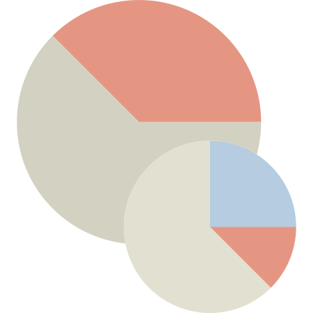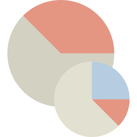
This image features a collection of vibrant pie charts designed to effectively represent data distributions and proportions. Each chart is uniquely styled with distinct color palettes, making them visually appealing and easy to interpret. Ideal for presentations, reports, and dashboards, these pie charts can be utilized in various fields such as business analytics, marketing research, and academic studies. The design allows for quick comprehension of complex data sets, enabling viewers to grasp key insights at a glance. Perfect for enhancing visual storytelling in any data-driven project.


Part of the
Color Design Tools SVG collection,
in Design.
Download the Dynamic Pie Charts for Data Visualization vector as a ready-to-edit .svg file —
it scales to any size without losing quality and can be recoloured in any
vector editor or straight in CSS.