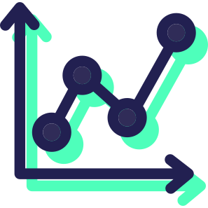
This line chart visualization effectively represents data trends over time, making it an essential tool for analytics in various business contexts. The design features multiple lines, each representing a different data series, allowing for easy comparison and analysis of performance metrics. Ideal for presentations, reports, and dashboards, this chart can be utilized in sectors such as finance, marketing, and operations to illustrate growth patterns, sales performance, or customer engagement metrics. Its clean and professional aesthetic ensures that it can seamlessly integrate into corporate branding while providing valuable insights to stakeholders.


Part of the
Business SVG collection,
in Business.
Download the Dynamic Line Chart for Data Analytics vector as a ready-to-edit .svg file —
it scales to any size without losing quality and can be recoloured in any
vector editor or straight in CSS.