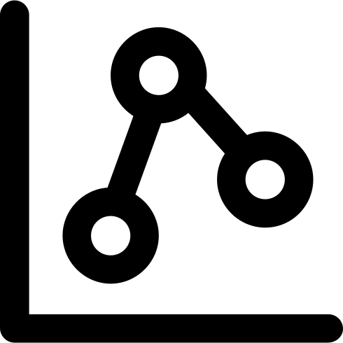
This line chart visualization effectively represents data trends over a specified period, showcasing fluctuations and patterns in numerical values. Ideal for presentations, reports, and dashboards, it serves as a powerful tool for data analysis and communication. The chart's clean design allows for easy interpretation, making it suitable for various contexts such as business performance tracking, financial analysis, and academic research. Users can customize the axes, labels, and color schemes to fit their specific data sets, enhancing clarity and engagement for audiences. This versatile graphic is an essential asset for anyone looking to convey complex information in a visually appealing manner.



Part of the
Communication SVG collection,
in Communication.
Download the Dynamic Line Chart Visualization vector as a ready-to-edit .svg file —
it scales to any size without losing quality and can be recoloured in any
vector editor or straight in CSS.