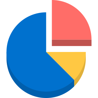
This pie chart visualization effectively represents data distribution in a circular format, making it easy to understand proportions and comparisons among different categories. Ideal for presentations, reports, and dashboards, this graphic can be utilized in various contexts such as business analytics, financial reports, and educational materials. The design allows for customization in color and labeling, enabling users to tailor the chart to specific datasets or branding requirements. Its clear and concise layout enhances data storytelling, making complex information accessible to a broader audience.
Part of the
Design Tool Collection SVG collection,
in Design.
Download the Dynamic Pie Chart Visualization vector as a ready-to-edit .svg file —
it scales to any size without losing quality and can be recoloured in any
vector editor or straight in CSS.