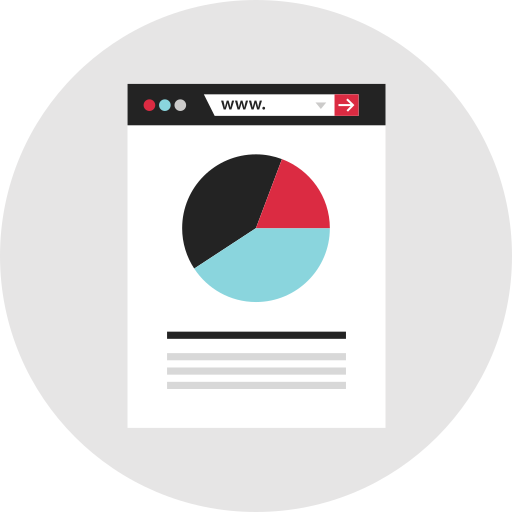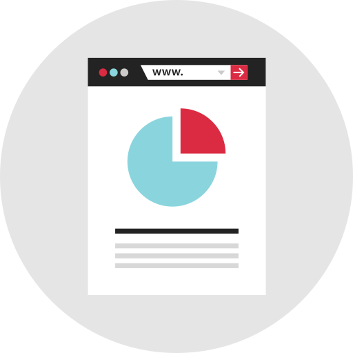
This pie chart visualization effectively represents data distribution across various categories, making it an essential tool for data analysis and presentation. Ideal for business reports, academic presentations, and marketing materials, the chart can illustrate proportions, comparisons, and trends in a visually engaging manner. Its clear segments and vibrant colors enhance readability, allowing viewers to quickly grasp complex information. This versatile graphic can be customized to reflect specific datasets, making it suitable for a wide range of applications in fields such as finance, healthcare, education, and more.


Part of the
Infographics SVG collection,
in Design.
Download the Dynamic Pie Chart Visualization vector as a ready-to-edit .svg file —
it scales to any size without losing quality and can be recoloured in any
vector editor or straight in CSS.