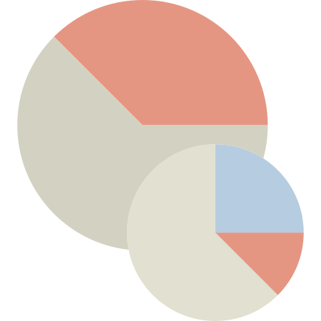
This image features a set of vibrant and dynamic pie charts, designed to effectively represent data in a visually engaging manner. Each chart is segmented into distinct sections, showcasing various proportions and categories, making it ideal for presentations, reports, and educational materials. The use of contrasting colors enhances readability and allows for quick comprehension of the data being presented. These pie charts can be utilized in business analytics, marketing strategies, and academic research to illustrate statistical information, trends, and comparisons. Their versatile design makes them suitable for both digital and print applications, ensuring that complex data is communicated clearly and attractively.


Part of the
Color Design Tools SVG collection,
in Design.
Download the Dynamic Pie Charts for Data Visualization vector as a ready-to-edit .svg file —
it scales to any size without losing quality and can be recoloured in any
vector editor or straight in CSS.