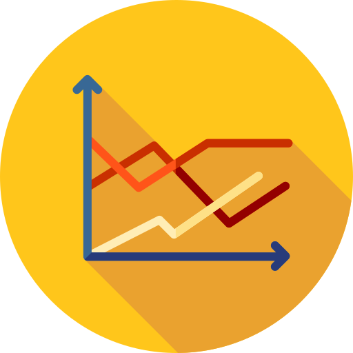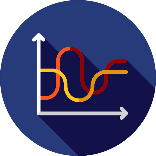
This line chart visualization effectively represents data trends over a specified period, making it an essential tool for data analysis and presentation. The chart features multiple lines, each corresponding to different data sets, allowing for easy comparison and interpretation of trends. Ideal for business reports, academic presentations, and financial analyses, this image can be utilized in various contexts, such as illustrating sales growth, tracking performance metrics, or displaying survey results. Its clear layout and distinct color coding enhance readability, making it suitable for both professional and educational environments.

Part of the
Charts & Diagrams SVG collection,
in Business.
Download the Dynamic Line Chart Visualization vector as a ready-to-edit .svg file —
it scales to any size without losing quality and can be recoloured in any
vector editor or straight in CSS.