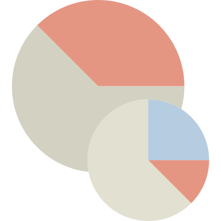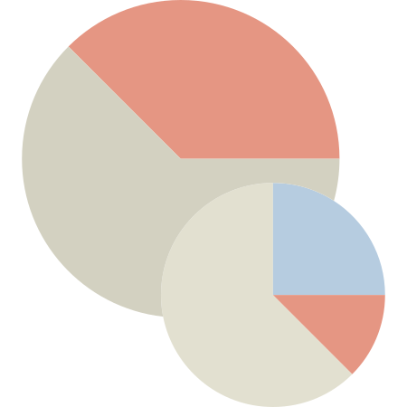
This graphic features a collection of vibrant pie charts designed for effective data visualization. Each chart is segmented into distinct sections, showcasing various data distributions and proportions, making it an excellent tool for presentations, reports, or educational materials. The color palette is thoughtfully chosen to enhance readability and engagement, allowing viewers to quickly grasp complex information at a glance. Ideal for business analysts, educators, and marketers, these pie charts can be utilized in infographics, dashboards, and digital content to illustrate trends, comparisons, and statistical insights in an aesthetically pleasing manner.


Part of the
Color Design Tools SVG collection,
in Design.
Download the Dynamic Pie Charts for Data Visualization vector as a ready-to-edit .svg file —
it scales to any size without losing quality and can be recoloured in any
vector editor or straight in CSS.