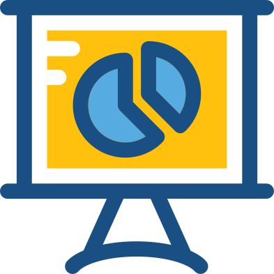
This illustration represents a dynamic presentation analytics dashboard, designed to visualize key performance indicators and metrics in a user-friendly manner. The image features various graphical elements such as bar graphs, pie charts, and line charts, all integrated into a cohesive layout that facilitates data interpretation. Ideal for human resources presentations, this graphic can be utilized in training sessions, workshops, or corporate meetings to showcase employee performance, recruitment statistics, and workforce analytics. Its modern design and clear visual representation make it an excellent tool for enhancing data-driven discussions and decision-making processes within organizations.


Part of the
Human Resources SVG collection,
in People.
Download the Dynamic Presentation Analytics Dashboard vector as a ready-to-edit .svg file —
it scales to any size without losing quality and can be recoloured in any
vector editor or straight in CSS.