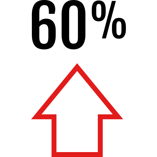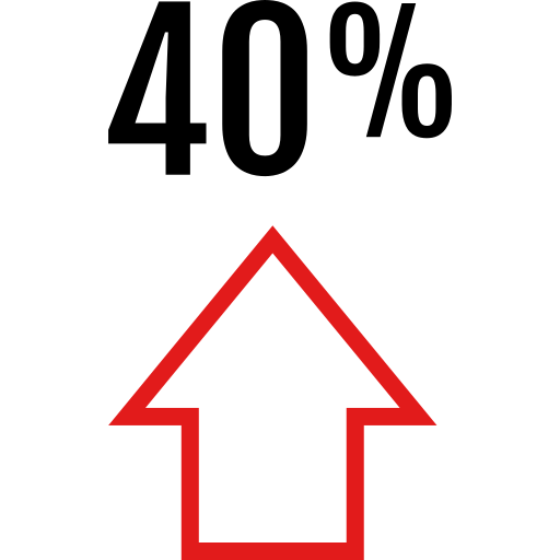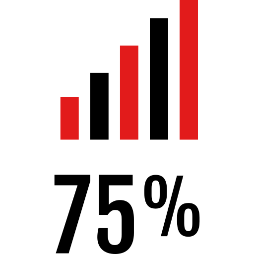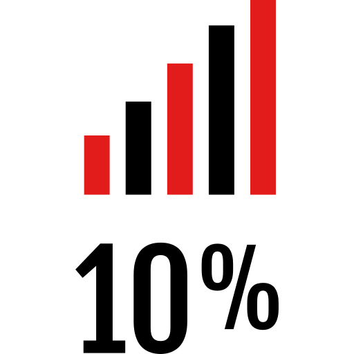
This vibrant pie chart visually represents statistical data in a clear and engaging manner, utilizing a bold red color palette that captures attention. Ideal for presentations, reports, and infographics, this chart effectively communicates proportions and comparisons among different categories. Its design is suitable for business analytics, marketing strategies, or educational materials, making complex data easily digestible for audiences. The pie chart can be customized to display various datasets, allowing users to convey insights and trends in a visually appealing format.



Part of the
Info Graphics Red SVG collection,
in Business.
Download the Dynamic Red Stats Pie Chart vector as a ready-to-edit .svg file —
it scales to any size without losing quality and can be recoloured in any
vector editor or straight in CSS.