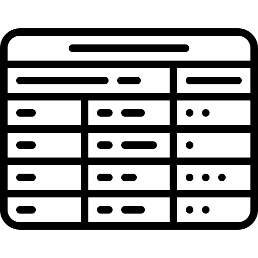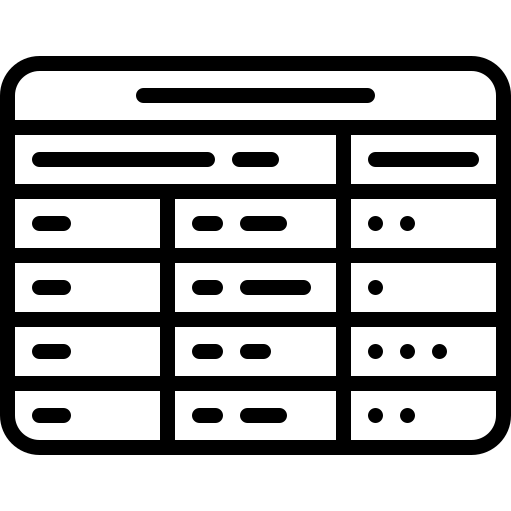
This illustration represents the concept of adaptive layout design, showcasing how various elements can dynamically adjust to different screen sizes and orientations. The image features a grid-like structure with flexible components, emphasizing the importance of responsive web design in modern programming. It serves as a visual guide for developers and designers, highlighting best practices for creating user-friendly interfaces that enhance accessibility and usability across devices. This graphic can be utilized in presentations, educational materials, or as a reference in design documentation to convey the principles of adaptive layouts effectively.

Part of the
Programming Line Craft SVG collection,
in Technology.
Download the Adaptive Layout Design Concept vector as a ready-to-edit .svg file —
it scales to any size without losing quality and can be recoloured in any
vector editor or straight in CSS.