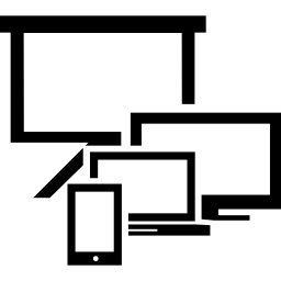
This graphic showcases a variety of screen sizes, ranging from smartphones and tablets to laptops and large desktop monitors. Designed to illustrate the differences in display dimensions, this image serves as a valuable resource for web developers, UI/UX designers, and digital marketers. It can be utilized in presentations, educational materials, or design documentation to emphasize the importance of responsive design and the need to optimize digital content across multiple devices. The clear representation of different screen sizes aids in visualizing how applications and websites will appear on various platforms, making it an essential tool for anyone involved in digital product development.

Part of the
Modern Screen SVG collection,
in Technology.
Download the Diverse Screen Size Illustrations vector as a ready-to-edit .svg file —


it scales to any size without losing quality and can be recoloured in any
vector editor or straight in CSS.