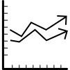
This graphic illustrates a dynamic multiple variable line chart, designed to visually represent the relationships between several data sets over a specified period. The chart features multiple lines, each corresponding to a different variable, allowing for easy comparison of trends and fluctuations. Ideal for use in data analytics presentations, reports, or dashboards, this graphic can help stakeholders quickly grasp complex data interactions. It is particularly useful in fields such as finance, marketing, and research, where understanding the interplay of various metrics is crucial for informed decision-making.

Part of the
Data Analytics SVG collection,
in Technology.
Download the Dynamic Multiple Variable Line Chart vector as a ready-to-edit .svg file —
it scales to any size without losing quality and can be recoloured in any
vector editor or straight in CSS.